Color can be so CONFUSING! We’ll do our best to break down the differences and help you decide which swatch books you should be using. To read about the mood behind color, check out our Color Theory post.
First, What’s the Difference?
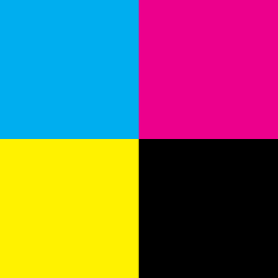 CMYK is the four color printing process. The letters stand for Cyan (C), Magenta (M), Yellow (Y), and Black (K). As a combination of tiny dots, these four colors together generate the printed image you see. Every single color is broken down into a percentage of C,M,Y, and K. Almost all printed material is achieved via CMYK, so if you’re planning on hitting “Print” you can probably rely on this model. Here’s the bottom line: we use CMYK ink and toner to print the majority of the jobs we receive. We have a Hamada four color press for the really big jobs, and a brand new Konica Bizhub Press C1060 for shorter runs.
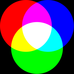 RGB is also important to branding because it is used in computer monitors. The screen you are reading this very article on is using additive colors to display images and text. Therefore, when designing websites (and other on-screen projects such as presentations), the RGB model is used because the final product is viewed on a computer display. Colors often look considerably different on a screen compared to the printed piece because the colors are achieved using red, green and blue instead of cyan, magenta, yellow and black. Having trouble getting that RGB neon green to print to the vibrant bright it appears to be? Either give up and find a CMYK substitute, or dive into a PMS book. It won’t be a match, but you’ll see the range of color printing can accomplish (it’s a much smaller realm than the millions of RGB colors at your disposal).
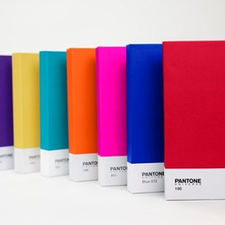 Last but certainly not least, let’s talk about the Pantone Matching System (PMS). When discussing your print job, you may be asked for your PMS or Spot color(s). The Pantone Matching System is the industry standard spot color printing system used in the United States. Using PMS colors is the best way to create consistency within your brand. Your company’s brand manual should include these numbers. If not, we recommend stopping in to establish the colors you would like to see moving forward. Pantone colors use a specific ink formula to achieve a specific hue. Reflex Blue, for example, is a Pantone. PMS jobs are printed on a press, using inks that are labeled much like oil or acrylic paints.
Now that that’s out of the way…
Think of these as three separate entities. CMYK, RGB, and PMS shouldn’t be intermixed or used inappropriately. Trying to print something CMYK that was saved as RGB or PMS is usually a disaster. A printer will try to “translate” these colors into a printable CMYK mixture, but most are impossible to match– especially if you let the machine do the translating! If your materials are going to be print AND digital, think about selecting not only your PMS colors but the closest bridge in CMYK and RGB. Remember that some PMS colors are easier to bridge than others. If you don’t have access to a PMS bridge guide, there are a lot of websites to help convert colors. Feel free to stop by and use our books, also.