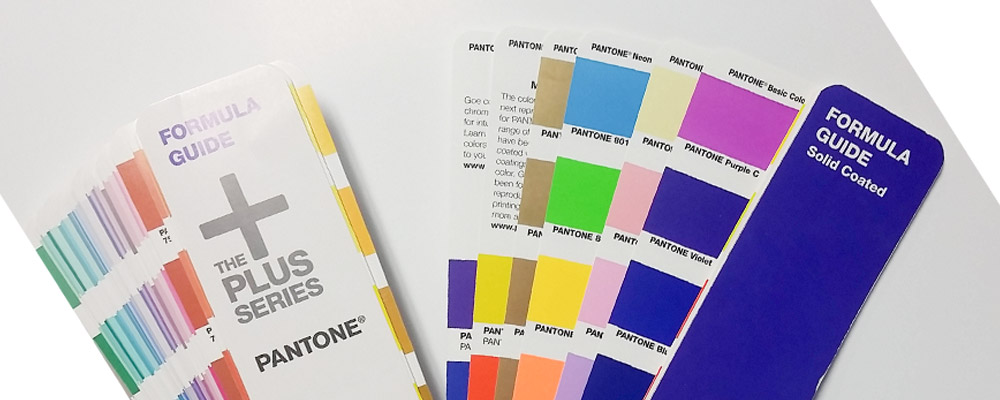
Spot Color 101
Pantone inks, usually known as spot colors, are specific inks that do not vary. Each pantone uses an exact recipe of unwavering base inks to create its own swatch. That swatch is numbered and then typically presented in two different swatch books – one on uncoated stock (U) and one on coated stock (C).
A spot color can also reference a Spot UV or Foil finish, but there’s a different blog post for that here.
Formula Guide
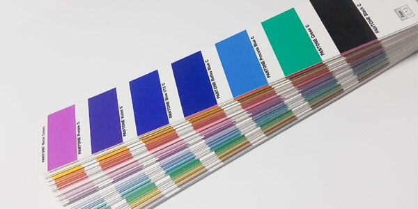
The base inks should be the very first colors in the swatch book. They break the numbering rule sometimes, simply using the color as the description – much like oil or acrylic paints. These “Basic Colors” in the Pantone Matching System are:
1. Pantone Yellow
2. Pantone Yellow 012
3. Pantone Orange 021
4. Pantone Warm Red
5. Pantone Red 032
6. Pantone Rubine Red
7. Pantone Rhodamine Red
8. Pantone Purple
9. Pantone Violet
10. Pantone Blue 072
11. Pantone Reflex Blue
12. Pantone Process Blue
13. Pantone Green
14. Pantone Black
15. Pantone White
There are also specialty metallic, pastel, neon, and Goe* bases – which should be easy to locate just behind the basic colors in the guide. *The Goe line is optimized for pairing with aqueous or UV coatings with minimal shifts in color. In other words, they’re ideal brand colors – no nasty print surprises!
All the Rest
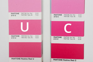
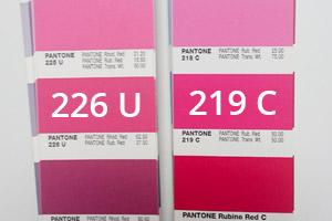
The rest of the pages in the formula guide are tons of color combinations using the base inks. Underneath each swatch is its title, such as Pantone 219 C. To the right of the title is the “mix” required to create that color. When you hear printers mention a mix and a wash, it’s because we mix that ink from our base inks and then wash it off the press after. 219 C is a 50/50 mix of Rubine Red and Transparent White, printed on coated stock.
The C (for coated stock) is just paper that’s been processed to add a finish such as gloss or matte. This finish makes the paper less absorbent, so the ink will not seep into the fibers. Rather, it rests atop the coating and therefore provides brighter, stronger color possibilities. This is the very reason swatch books use a C and a U version. In fact, most brands will choose their coated PMS color, and then find a different uncoated swatch to better match their choice. 219 U is an ok substitute for 219 C, but 226 U looks like a stronger match from the images below.
Pros VS. Cons
The clear advantage of using the Pantone Matching System is 100% color accuracy. Some of those specialty inks are only available as such, and are impossible to replicate using standard ink or digital toner. Choose spot colors for logos and branded materials such as envelopes or letterhead that would print in runs of 500+ on the press.
The disadvantage can be cost, especially if you start to climb over two spot colors in a project. Mixed inks cost more than basic inks. All colors with the exception of black add a wash. Still, don’t fret: Most one or two color projects are cheaper than full color (CMYK) printing, especially in higher quantities.
One odd disadvantage is dry time. All inks need time to dry, but some are notoriously slow. Reflex blue is the worst of them– some experts claim it never fully dries. One easy workaround? Avoid it altogether by choosing a strikingly similar swatch, Blue 072 or standard dark blue.
Printer Lingo
In printer’s terms, a two-sided one color job would be labeled 1/1. One color this side, one color that side. A two color, one sided job would be 2/0. Two colors, no back. Since the 2 can be any swatch, even black, always call out the exact Pantone number.
5/0 is a one-sided job that could either mean CMYK plus a Pantone, or CMYK plus a specialty finish like Spot UV or Foil. 4/1 is CMYK printing on the front, and one color on the back. We’d assume black, but best to call it out by number so we can quote it properly. Hint: Black is always going to be the cheapest.
There’s a lot of information to absorb about color, and spot colors are just the beginning. To read more about CMYK printing or the RGB spectrum, follow the links below!